
Table of Contents
- Why Fabric Selection Feels Harder Than It Should
- Start With One Fabric You Truly Like
- Build A Simple Color Palette
- Pay Attention To Value, Not Just Color
- Mix Print Sizes With Purpose
- Use Solids, Blenders, And Low-Volume Prints
- Try The Three-Step Fabric Pull
- Use A Quick Test Before Buying Or Cutting
- Choose Fabric For The Pattern And Project
- Common Mistakes To Avoid
- A Simple Checklist For Your Next Fabric Pull
- Conclusion
Choosing quilt fabrics can feel surprisingly difficult when every bolt is beautiful on its own. In Pasadena, California, where bright daylight can make color differences easy to see, a fabric pull benefits from a little structure. The goal is not to find fabrics that match perfectly. It is to give every fabric a useful job in the finished quilt.
For local makers building a palette, the best quilting store Pasadena CA, is a natural starting point. Odds N Ends Fabric, located in South Pasadena, offers an online shop with batiks, basic blenders, precuts, solids, novelty prints, reproduction fabrics, and books and patterns. That range makes it easier for quilters in South Pasadena and nearby Los Angeles County communities to compare print scale, value, and color families before committing to a project.
Why Fabric Selection Feels Harder Than It Should
A large selection creates decision fatigue. It is easy to keep adding fabrics because each one is appealing, then end up with a group that feels crowded or unfocused. Color matching matters, but it is only one part of a successful quilt palette. Value, print scale, texture, contrast, and proportion all affect the final result.
A simple plan prevents many costly mistakes. Rather than trying to make every fabric equally important, choose a clear visual direction and let the remaining fabrics support it. This approach works for an airy California-inspired quilt, a traditional sampler, or a bold modern design.
Start With One Fabric You Truly Like
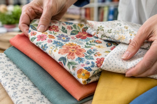
Begin with a focus fabric, usually the print that makes you want to start the quilt. A multicolor floral, a graphic novelty print, or a favorite batik can provide a ready-made palette. Look closely at the colors already present, then pull possible companions from those shades.
If the fabric has printed color dots along the selvage, use them as a starting clue rather than a strict rule. The focus fabric also establishes mood. Soft peach, sage, and cream may suggest a calm quilt, while deep navy, mustard, and coral can create a more energetic look.
Build A Simple Color Palette
A limited palette often looks more intentional than a random mix. Use this easy formula:
- Choose one main color from the focus fabric.
- Add one or two supporting colors that repeat or relate to it.
- Include a neutral or low-volume print that gives the eye a resting place.
- Add a small accent color only if the palette needs extra contrast.
Warm colors such as red, orange, and yellow tend to feel lively, while blues, greens, and violets often create a cooler mood. Opposite hues can add sparkle when used in controlled amounts. Basic color relationships and contrast can be useful guides, but your own fabric arrangement matters more than following a formula perfectly.
Pay Attention To Value, Not Just Color
Value means how light or dark a fabric appears. Two fabrics can be different colors but nearly the same value, which can cause patchwork shapes to blend. A quilt made mostly from medium-value fabrics may look flat, especially from across a room.
Include a visible range of lights, mediums, and darks. Before cutting, lay the fabrics together and step back several feet. You can also take a phone photo and view it in grayscale. If the blocks still look distinct without color, the value contrast is likely doing its job.
Mix Print Sizes With Purpose
Print scale refers to the size of the motif. Large-scale prints create movement and visual energy, while small prints read more like texture from a distance. A balanced pull often includes one large print, a few medium prints, and smaller prints or solids.
Avoid placing several loud, large-scale prints side by side unless a deliberately busy look is the goal. Give the largest print room to shine, then use quieter fabrics to support it.
Use Solids, Blenders, And Low-Volume Prints
Solids create clear shapes and can make a complicated pattern easier to read. Blenders add color with subtle texture, while low-volume prints offer visual interest without competing with the main fabrics. A cream print with tiny dots, pale gray text, or soft tonal leaves may function almost like a neutral.
When your focus fabrics are busy, choose a calmer background. That breathing room can make the quilt feel more organized and can help pieced points, stars, or appliqué stand out.
Try The Three-Step Fabric Pull
1. Choose The Focus Fabric
Pick the fabric that sets the direction for color, style, and mood.
2. Add Supporting Fabrics
Pull two to five fabrics that share a color, value range, or overall feeling with the focus fabric. Do not worry if every fabric contains every color.
3. Add The Background
Select a light, dark, or neutral fabric to separate the main prints and help the piecing read clearly.
Use A Quick Test Before Buying Or Cutting
- Lay fabrics together in the order they may appear in the quilt.
- Step back and look for one fabric that overwhelms the rest.
- Take a photo in natural light and check it in grayscale.
- Remove a fabric if the group feels crowded.
- Add a lighter or darker option if the palette lacks contrast.
Choose Fabric For The Pattern And Project
Always check pattern requirements before shopping. Consider fabric width, yardage, directional prints, and whether the pattern depends on strong contrast. Think about how the finished quilt will be used, too. A frequently washed lap quilt or baby quilt may call for comfortable, durable quilting cottons, while a wall quilt can prioritize visual impact.
Precuts can simplify a coordinated project, especially when a pattern is written for charm squares, strips, or fat quarters. If a particular print is essential, consider buying extra while it is available. Matching a discontinued fabric later can be difficult.
Common Mistakes To Avoid
- Choosing every fabric in the same print scale.
- Using mostly medium-value fabrics.
- Adding too many competing focus prints.
- Selecting colors that coordinate but have little contrast.
- Skipping a quiet background or neutral fabric.
- Buying yardage before confirming pattern requirements.
A Simple Checklist For Your Next Fabric Pull
- Do the fabrics share a color, mood, or style?
- Is there a clear range from light to dark?
- Are the print sizes varied?
- Does one fabric act as the visual star?
- Is there enough quiet fabric for balance?
- Does the group still look cohesive from a distance?
Conclusion
Choosing quilt fabrics becomes easier when every piece has a role. Start with one fabric you love, repeat a few of its colors, vary the values and print sizes, then add a calm background. A thoughtful fabric pull does not need to be complicated. It simply needs enough contrast, variety, and breathing room to make the finished quilt feel intentional.